Introduction
Founded in 1991, Staples is an organization with a network of over 300 stores across Canada. Known as the “Working and Learning Company”, their mission is to support customers with expert knowledge, unique products and innovative services, made for the changing needs of today’s entrepreneurs, teachers, parents and students.
As part of the company’s print and tech services operation, the Solutionshop offers customers a complete marketplace that helps every aspect of a business including design, printing, marketing, shipping and tech services (in-store and online).
Team
Solutionshop
Role
Senior Product Designer
Objective
Increase shopping conversion rate with an enterprise cart and checkout revamp
Outcome
Saw a 12% increase in shopping conversion rate and an increase in shopping task efficiency by 3%
Tools
Figma, Figjam, Jira/Confluence, Usertesting.com, Baymard Institute
Context
Staples Copy & Print was rebranded to Staples Solutionshop back in 2019.
Up until 2022, Solutionshop had outsourced their design work to a third-party agency
Senior leadership decided to go in-house with design, in the process unifying the existing design system on staples.ca with Solutionshop.
The agency created their own hybrid design system (new components added on top of an old design system but not sitting in the same library) which made it difficult to merge with the new design system that Staples’ other lines of businesses were building.
The Problem
Customers were experiencing different front-end checkout flows depending on the site their Staples line of business was associated with. Staples Preferred and Staples Professional users had their own checkout UX while Staples Solutionshop utilized a different checkout UX.
As Staples.ca and Solutionshop were both being redesigned, the decision was made to merge the front and back-ends of both into an enterprise checkout initiative with the ultimate goal of supporting multiple lines of business in a single transaction. So imagine, purchasing paper products from staples.ca and shredding services from Solutionshop all in the same cart.

What did the old Staples checkout look like?
Pain Points
Clunky Navigation
Perhaps the top reported pain point was frustration towards busy/cluttered components, confusion with inputs and general uncertainty when proceeding through each checkout step.
Inventory & Fulfillment
Users have difficulty selecting their fulfillment method. In addition, a high volume of users were encountering inventory errors in checkout.
Payment
Users are not provided with clear and actionable copy when they encounter errors with their method of payment, leading to low NPS and negative mentions in Chatter
Mobile Friendliness
Users had trouble with navigation and a lengthy scroll on mobile devices, resulting in low conversion % on mobile
“How might we improve conversion in our cart & checkout experience by eliminating any roadblocks for our customers and improve efficiency when completing their order transaction?”

Competitive Analysis
What are others doing with their checkout and could I find some inspiration from a discovery standpoint?
Walmart
Walmart starts its checkout flow by asking shoppers to create an account. This might not be ideal for all businesses but Walmart has the advantage of being able to offer huge savings, which in part makes up for the inconvenience of having to sign up.
The site does a good job of explaining why it’s worth creating an account
After pre-checkout, shoppers are brought to a single page checkout
Walmart’s order summary is great at highlighting savings made through special offers plus the free shipping
Forge To Table
This Japanese cutlery ecommerce checkout page caters to guests but also allows repeat customers to log in and have their details auto-filled.
Forge To Table uses a minimalist accordion design which is used by many big ecommerce companies such as Amazon, Stripe, Google, Visa. It is currently synonymous with modern day UX best practice.
Note that the page asks a question at the end of the delivery section:
While gathering this data can improve marketing efforts, it’s important to remember that unnecessary questions add a further distraction and potentially lengthen the checkout journey
Etsy
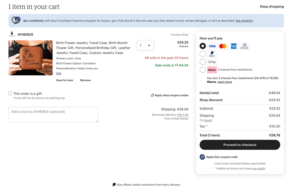
Etsy’s shopping cart functions as a ‘pre-checkout’, directing shoppers to different checkout flows depending on their preferred payment method.
Offering varied payment methods helps Etsy appeal to shoppers who desire express checkout or pay-later options.
Upon entering the multi-page checkout flow, Etsy prominently displays a security logo and progress bar at the top of the screen
Frequently seen in multi-page checkouts, progress bars help shoppers see where they are, reducing uncertainty. Meanwhile, the security logo reassures shoppers that Etsy has taken steps to protect their data.
When it comes to entering details, Etsy keeps its forms clean and simple
General Themes
Make form fields as fast and intuitive as possible
Anything that causes confusion or unnecessary friction can increase cart abandonment rate (this includes removing potential distractions)
Enabling guest checkout
Forcing the customer to sign up can make sense for some business models—but in most cases, enabling guest checkout is ideal
Show the customer where they are in the process
Consider accordion-style design for single-page checkout and progress bars for multi-page checkout
Highlighting service benefits
Overcome lingering doubts by highlighting money-back guarantees, free delivery, returns, or customer support service
Adding trust elements
Security-related graphics and payment provider logos reassure customers that your site is trustworthy
Design
After research, preliminary testing on the current checkout, and then competitive analysis, design of the new checkout was separated into two phases. The first phase would focus on the cart page (pre-checkout) and flesh out different scenarios. Phase 2 would tackle everything after the cart page including shipping, payment and confirmation. By structuring checkout redesign in two phases, the aim was to fully address any gaps and create a more wholly comprehensive checkout experience for customers.
Phase 1
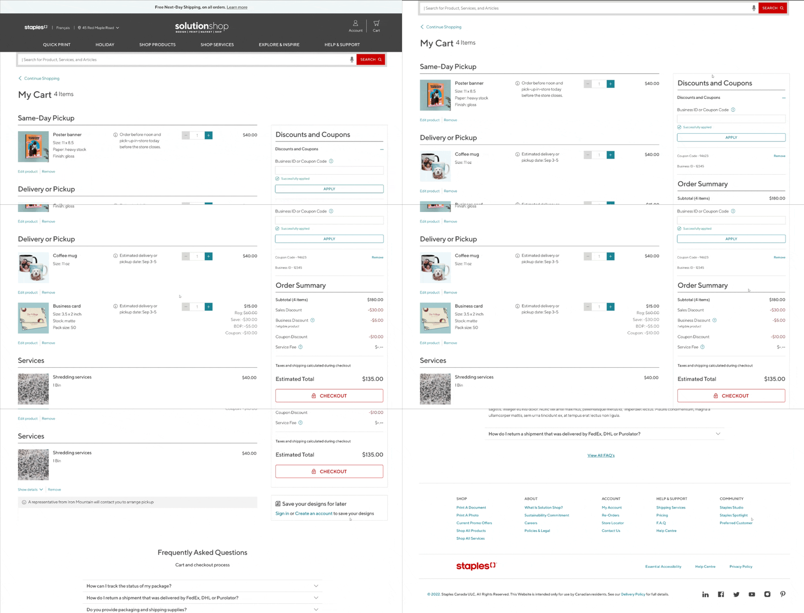
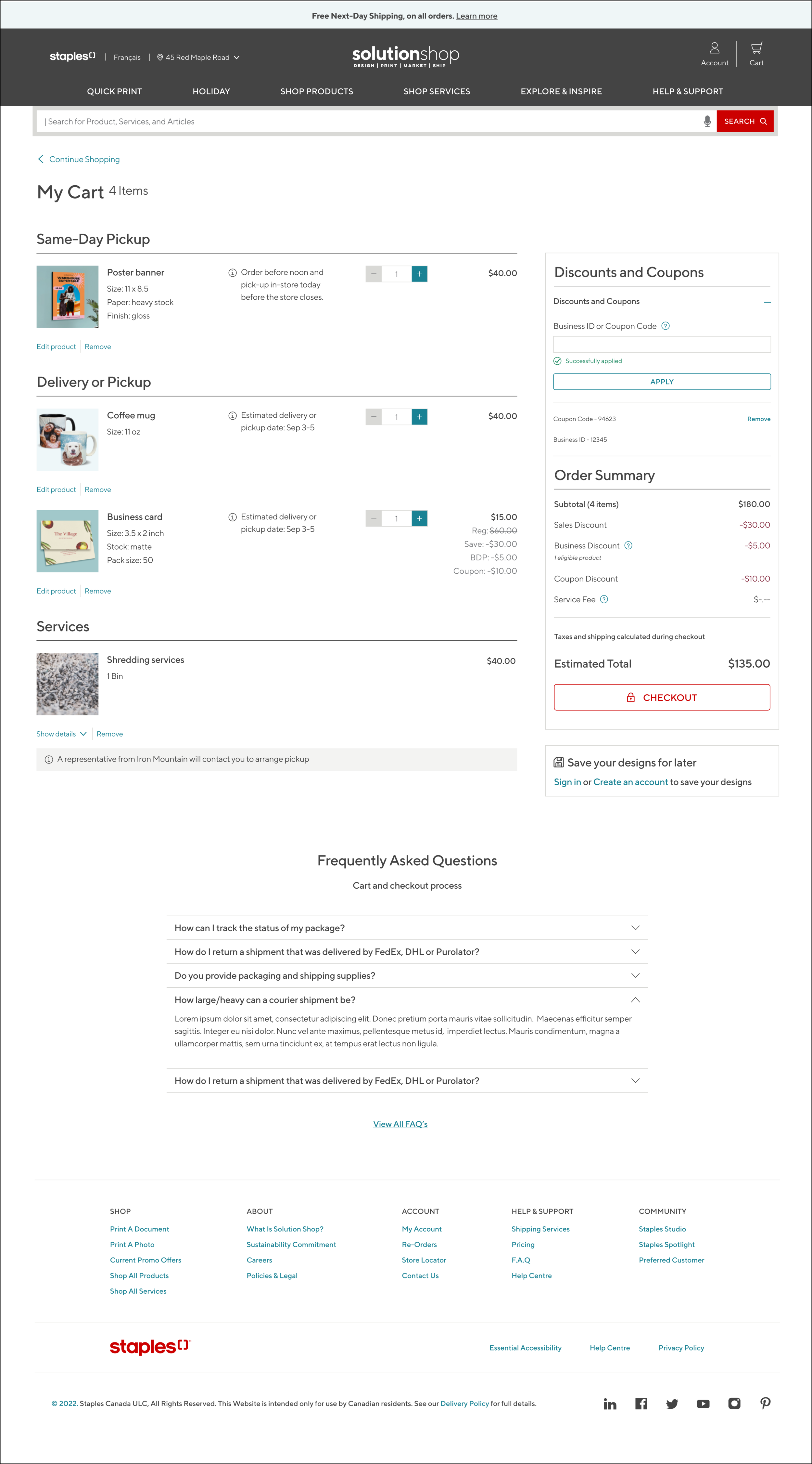
Phase 1 was quite straightforward in terms of strategy. I knew I needed to account for all the different scenarios and states as far as what customers would have in their cart or what I called “pre-checkout”.
Cart
empty state cart
single item, single fulfillment
multiple items, single fulfillment
single item, multiple fulfillment
discounted product(s) w/ expanded states for coupon codes and discounts
service fees, shipping and taxes
signed-in user vs guest flow
Phase 2
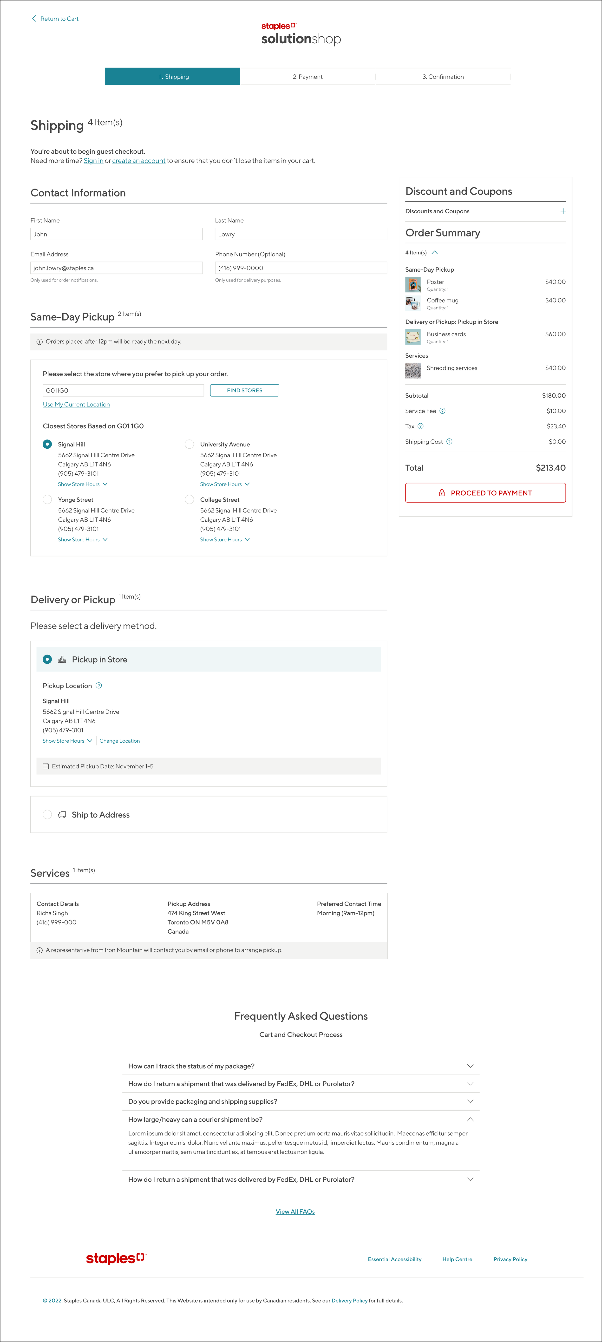
Phase 2 included shipping, payment and confirmation . I believed with the way Staple’s inventory and fulfillment was setup, it made sense to maintain a multi-stage checkout after the initial cart single page view. The progress bar up top however, would display AFTER the user had progressed from the cart viewing page.
There were many scenarios that I had to account for in phase 2 as well. This included:
Shipping
mixed fulfillment (shipping)
same day pickup (shipping)
delivery/pickup (shipping)
services only
discounts (applied at product level and entire cart)
Payment
smooth and secure payment flow
different payment options
Order Confirmation
order success visual
clear navigation back to Staples products’ home page
MVP Testing & Feedback
I took these designs through multiple rounds of feedback after they went live in production and there were further adjustments made based on immediate impact and feasibility.
When comparing the new checkout with the old, several distinguishing factors became evident from usability testing:
Customers automatically noticed the storefront felt more modern with a refreshed look and feel. Arial font was replaced with TT Norms, a font with semi-rounded features giving a feeling of warmth without sacrificing the structure that Arial provided.
Customers said they felt less information overload and clearer navigation in part due to better spacing, component positioning and visual hierarchy (especially with regards to font colour, weight and size to emphasize prioritized info).
The original checkout flow contained many options that the user needed to specify and the customers would often skip over defaulted inputs which led to mistakes and more manual corrections. By grouping checkout specifications into linear steps, customers started focusing their attention and after the design went live, users immediately spent less time on tasks, made less mistakes and cart abandonment rate decreased.
Mobile responsiveness had previously been an afterthought. Layouts were jumbled and small tap targets for toggles caused annoyances. To ensure customers had no problems with components, screen widths or finicky tap targets we decided on fixed headers, larger input fields and buttons, and clean visual hierarchy.
The Impact
The company saw a 12% increase in shopping conversion rate on the SolutionShop side of the business. Online customer satisfaction went up by roughly 4.6% via customer feedback and review tracking analytics, while efficiency of shopping tasks increased by around 3%.
These metrics indicated a high measure of success and boded extremely well for the enterprise checkout initiative in the pipeline.

Next Initiatives
Enterprise Checkout
The initiative to merge SolutionShop and Staples.ca into a single enterprise checkout system (using this new checkout design as a launch point) promises to make the online shopping experience smoother and more efficient than before. By integrating the two platforms, customers would be able to browse and purchase from both brands in a seamless manner. This move would also streamline the checkout process, eliminating the need for multiple log-ins and a complicated payment process. With this merger, customers would have access to a wider range of products and services, and be able to enjoy a more user-friendly online shopping experience. This is a significant step forward for both brands, and promises to take online shopping to the next level.
Partnership API Dashboard
Another huge initiative that I was quite deep in, was building a partnership API dashboard. The idea was to allow corporate partners and vendors to scale through Staples production capabilities, logistics and retail footprint with minimal cost and time. Strategically, it would expand beyond submission of print jobs to a full platform that would provide everything a partner needed to grow and build their print offering. I was no stranger to dashboards so this project was interesting. Our MVP entailed a centralized interface for partner admin users. It provided order search and tracking capability. Partners can monitor performance and service level agreement KPIs. Order details and monthly reports were also available to download off this platform.


